

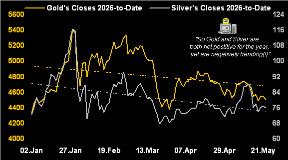
98 trading days are thus far in the book for Gold during 2026, within which there’ve been five more up days than down days. Not as positively skewed as one might think. But in settling yesterday (Friday) at 4511, Gold year-to-date is +4.1%, a far cry from having been up as much as +28.9% back at 29 January’s intra-day high of 5586.
“What about for Silver, mmb?”
Well Squire, in settling yesterday at 75.92, she’s +7.0% year-to-date, albeit as well quite below her +71.6% peak of 121.79, also on 29 January. However, en route-to-date, Sister Silver has thus far recorded 13 more days up than those down.
Regardless, this year Gold first achieved its present 4511 level just four trading days into 2026 on 07 January. And as for Silver, she initially traded her current 75.92 price just two days in on 05 January. Therefore — aside from the precious metals interim volatility eliciting All-Time Highs — their respective net positive changes-to-date now appear comparably modest. In fact, when applying linear regression to both price lines, such trends (basis daily closes) year-to-date are actually negative. Makes for a rather ugly chart, what?
Precious metals prices perspectives, indeed!
“Well, that won’t be on CNBS, right mmb?”
Our like sentiment, Squire. Yet because of prices’ robust start to 2026, folks think both precious metals are having a stellar year. To wit, we just went to “AI” (“Assembled Inaccuracy”) as follows:
- The Query: “Are Gold and Silver having a great year?”
- The Response: “Yes, both metals are having a standout run…”
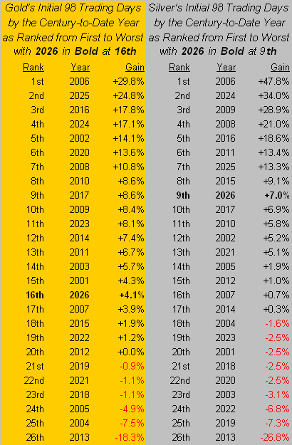
That, even as Gold is now -19.3% below its record high, and Silver -37.7% beneath same. Further — as currently priced — one might deem Gold’s present stance these 98 days into the year as rather mediocre, albeit Silver’s as relatively good. Now into the 26th year of the 21st century, these 98 trading days-to-date rank only 16th-best for Gold, but for Silver a bit better at 9th-best:
Too, by the opening Scoreboard’s valuations, although Gold at present is -5.4% below its near-term BEGOS Market Value of 4766 — which is borne of price’s changes relative to those of the five primary BEGOS Markets (Bond / Euro / Gold / Oil / S&P 500) — the broader measure of Fair Value is now 4023, price thus +12.1% high by that metric. As for Silver, she is now +30.7% over her Fair Value of 58.09 … just in case you’re scoring at home. Hardly does that preclude further record high prices, but the “Means Reversion Dept.” inevitably intercedes, (which for you WestPalmBeachers down there “means” price eventually meets with Fair Value, itself generally rising).
“But mmb, when the Fed starts raising, that can decrease Fair Value, right?”
Squire, we saw that occur during 2023-2024. However, we again hearken back to the rate rise cycle of 2004-2006, nonetheless through which Gold basically rose. (That courtesy of the “Gold Plays No Currency Favourites Dept.”).
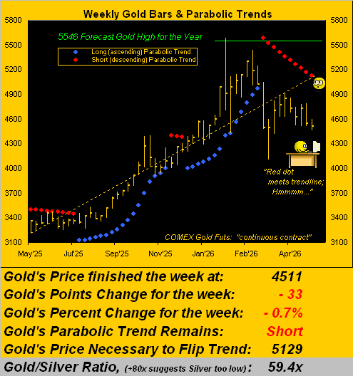
As to “The Now”, our weekly bars graphic of Gold from a year ago-to-date exhibits a convergence of the rightmost red parabolic Short dot — such trend now ten weeks in duration — with the dashed linear regression trendline. Does that foretell anything? Unlikely, (but we tend to notice little things like that).
More important perhaps is noticing the distance present price is from the dashed trendline, indeed better than -600 points, which across these year-over-year weekly closing prices is the largest negative deviation: thus arguably, a technically oversold bounce is “due”, albeit ’tis of course contra to the current Short trend. Either way, here’s the graphic:
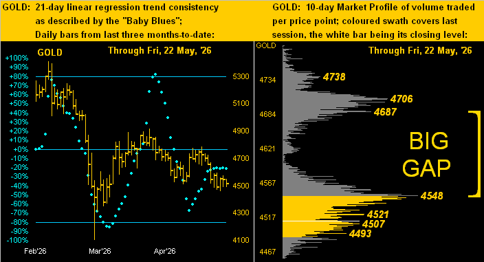
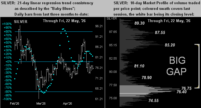
Drilling in a bit deeper, next we’ve our two-panel graphic of Gold’s daily bars from three months ago-to-date on the left and 10-day Market Profile on the right. The baby blue dots depicting regression trend consistency are essentially wandering as is price within the downtrend. As for the price stack in the Profile, massive is the “Big Gap” spanning 139 points, which is also wider than Gold’s expected daily trading range of now 103 points, bounded on the low side by the volume-dominant 4548 resistor as labeled:
Turning to the like graphic for Silver, her twists and turns across the past three months (below left) are fairly in sync with those for Gold, although as we know, the white metal’s percentage amplitude is greater than that of the yellow metal. And like Gold, Silver too has formed a Big Gap in her Profile (below right), the volume-dominant resistor there being 76.75. Silver’s expected daily trading range? 4.42 points, which is greater than her trading range for the entire year of 2018 (3.85 points):
Now let’s turn to trouble. For technically overdue to substantively drop — and fundamentally so to crash — is the S&P 500. In settling this past week at 7473, the more appropriately dubbed “Casino 500” is now “textbook overbought” through the last 32 trading days whilst its price/earnings ratio remains ever so extended beyond the exosphere at 48.1x.
Feeding the properly cap-weighted “trailing twelve months” P/E formula into “AI” results in it initially stalling, followed by“Thinking some more…”, only to then hilariously come up with 26.5x … proving yet again that “Assembled Inaccuracy” remains incapable of performing upper grammer school arithmetic. Still, we always enjoy the light-grey, fine print disclaimer that “AI responses may include mistakes. For financial advice, consult a professional.”
Meanwhile, in consulting the final results of the just concluded Q1 Earnings Season, ’twas comparably robust over Q1 of a year ago: of the 446 S&P constituents reporting within the seasonal timeframe, 80% bettered their bottom lines, an exceptional performance. Disregarding 2021’s “climbing out of COVID” period, this past Earnings Season sported the best year-over-year percentage of constituents improvement since Q3 of 2018 when ’twas 85%. ‘Course, the P/E isn’t going down because the price keeps going up. Thus the preference for yield-less, “all-to-risk” equities continues over “risk-free” Treasuries even as the latter continue to yield more than triple that of stocks. (Did we mention “means reversion” earlier?)
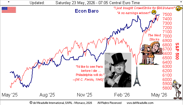
As to the Economic Barometer, the past week’s load of eight incoming metrics was fairly light, half of which improved period-over-period. The eye-catcher for us was the Conference Board’s Leading Indicators (to which we regularly refer as “lagging”, given the Econ Baro is well ahead of them). But this April report for just the fifth time in the past 48 months recorded a positive change, (a whopping +0.1%). However come May, the change may again be negative, notably as that month’s already-reported Philadelphia Fed Index swung from +26.7 in April to now -0.4. Poor ol’ Philly! Here’s the Baro:
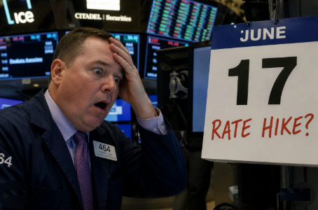
To close, regular readers well-know that because we duly track inflation, we’ve suggested for a couple of years now that the Federal Reserve’s Open Market Committee really should raise their Bank’s Funds rate. Yet finally, some in the trading world also are starting to realize same. Welcome aboard, to wit this phrase reported yesterday, (hat-tip Bloomy): “Bond traders are fully pricing in an interest-rate hike by the [behind the curve] Federal Reserve this year.” And within next week’s mix of incoming Econ Baro metrics is the “Fed-favoured” inflation gauge of Personal Consumption Expenditures for April: annualizing its consensus for both the “headline” and “core” numbers continues to state inflation as well above the Fed’s +2% target. So just how shall the FOMC’s 17 June Policy Statement read?
Stay perspectively tuned, and (in the spirit of aforementioned 2004-2006) your Gold holdings unpruned!
Cheers!
…m…
www.TheGoldUpdate.com
www.deMeadville.com
and now on “X”: @deMeadvillePro
deMeadville. Copyright Ⓒ 2010 – 2026. All Rights Reserved.
Read the full article here