

Is the Fed divided? That is a good question, as today, rather than finding unanimity amongst the Fed governors, they are divided into hawks and doves. The hawks see inflation still as a problem, while the doves worry more about recession. What’s interesting is that previous periods of dissension and division amongst the Fed governors have preceded stock market crashes and recessions. This was most notable during the late 1960s, the late 1970s, prior to the dot.com peak, before the onset of the 2008 financial crisis, and before the pandemic.
We look at the divisions and how they pinpointed an economy at a turning point. All this against a background of the president wanting to oust the Fed Chairman now in order to get his way of dramatically lowering interest rates. The upcoming FOMC meeting, Dec 9-10, has an 87% chance the Fed will cut rates.
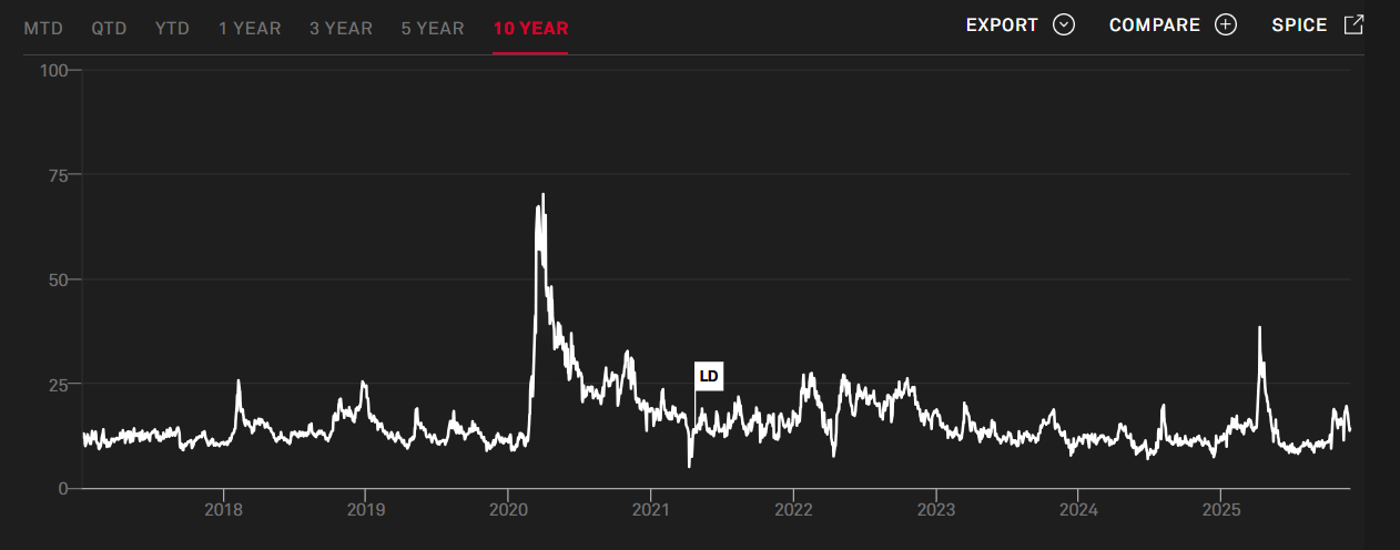
Rising volatility is a key characteristic of a turning point. Our chart of the week looks at rising volatility as measured by the VIX Volatility Index prior to the turning point.
The odds of the Fed cutting rates at its December 9-10 meeting are high at 87%. That helped spark a sharp rebound in markets this past week as both the stock market and the precious metals rose sharply. Silver broke out to new all-time highs, leading the precious metals. Oil prices continue to languish, but once again the energy stock indices rose, appearing to signal that things could change. Natural gas prices jumped again to new 52-week highs. This may bode well for Secure Waste Infrastructure Corp., an energy infrastructure and waste management firm, that reported increased EBITDA, strong discretionary free cash flow, pays a dividend, and is held in the Enriched Capital Conservative Growth Strategy.*
It’s the last month of what has been a difficult year despite the strong markets. December is normally a good month for markets. Will 2026 bring more of the same, or will things begin to unravel? The signals aren’t good.
Snow is on its way. Have a great week!
DC
* Reference to the Enriched Capital Conservative Growth Strategy and its investments, celebrating a 7 ½ -year history of strong growth, is added by Margaret Samuel, President, CEO, and Portfolio Manager of Enriched Investing Incorporated, who can be reached at 416-203-3028 or [email protected]
“Remember to look up at the stars and not down at your feet.”
—Professor Stephen Hawking, English theoretical physicist, cosmologist, Director of Research for the Centre for Theoretical Cosmology and University of Cambridge, U.K., Lucasian Professor of Mathematics at Cambridge (1979-2009), author, introduced the concept of micro black holes; 1942–2018
“There’s no such thing as a loss; it’s just an unmonetized lesson.”
—Ted Weschler, American hedge fund manager, currently investment manager for Berkshire Hathaway; b. 1962
“I hate to be wrong. That has aborted many a tempting error, but not all of them. But I hate much more to stay wrong.”
—Paul Samuelson, American economist, first American to win Nobel Prize in Economics, author of Foundations of Economic Analysis, best-selling economics textbook Economics: An introductory Analysis (1948), advisor to presidents John F. Kennedy and Lyndon Johnson, Keynesian School of Economics; 1915–2009
Is the Fed divided? The Fed normally speaks with one official voice after each meeting, but behind the scenes, there can be differences. The Fed usually votes 12-0, 11-1 in favour of whatever the consensus was. But of late, there have been more differences. The result is that one voice begins to break down. Today, there are hawks and doves.
The doves:
- Worry more about unemployment, economic weakness
- Prefer lower interest rates now
- Think inflation is easing or temporary
- Believe the economy can’t withstand overly tight policy
The hawks:
- Worry more about inflation
- Prefer higher rates for longer
- Fear that inflation expectations will become unanchored
- Think the economy can stand more tightening
These divisions show up in speeches from Fed governors or regional Fed presidents, or they might show up in the FOMC minutes. All this sparks uncertainty, with traders and economists having to guess what might happen. Note and bond yields will fluctuate. If hawkish, the stock market might fall. But if dovish, the stock market might rally. Volatility is bound to increase. But what these divisions really signal is that the economy could be at a turning point, and the odds of a recession are increasing.
That’s where we sit now. Inflation has fallen but remains stickily high and above targets. Unemployment is rising, although the figures are not dire yet. Recession or inflation is still in the works. All of this suggests to us that we are at a turning point.
In the past, divisions have often signalled that a recession could soon be upon us. We found some information on what happened when there were previous splits amongst the Fed officials:
|
Period |
What was happening |
Stock market response |
|
1968–1970 |
Split as to inflation/jobs |
Volatility rose, 1969–1970 bear market |
|
1978–1982 |
Division under Fed Chief Paul Volcker |
Huge swings, deep recessions in 1980 and 1981–1982 |
|
2000 |
Is dot.com a bubble or not? |
Markets peaked in March 2000 and fell 49% into 2002. Exacerbated by September 11, 2001 (9/11) |
|
2006–2007 |
Is the housing market tippy or is inflation a problem? |
Peak stock market in October 2007. The financial crisis in 2008, down 55% |
|
2018–2019 |
Trump trade wars and inflation |
Stock market falls 20%+ Q4 2018, recovers into 2019, followed by pandemic crash 2020 |
|
2024–2025 |
Trump trade wars, inflation down but above targets, unemployment rising, sentiment very poor |
The stock market is vulnerable to a sharp correction as the AI bubble breaks |
Source: www.federalreserve.gov
According to some analysts, the “consensus’’ at the Fed is breaking down. That means that monetary policy is no longer what the Chairman thinks or wants (Jim Bianco-Bianco Research, www.biancoresearch.com). If the 7-5 vote is against the Chairman, then the Chairman can’t change it. A 7-5 vote is a 7-5 vote and signals dissension. 12-0 and everyone is on the same page. The term for the current Chairman, Jerome Powell, is officially up on May 15, 2026. Regardless of President Trump’s desire to fire him, he can’t legally do so and has to wait it out. What’s key, however, is that whoever replaces him must have the respect and confidence of the Fed governors, or confusion and chaos could reign. And that would be terrible for markets.
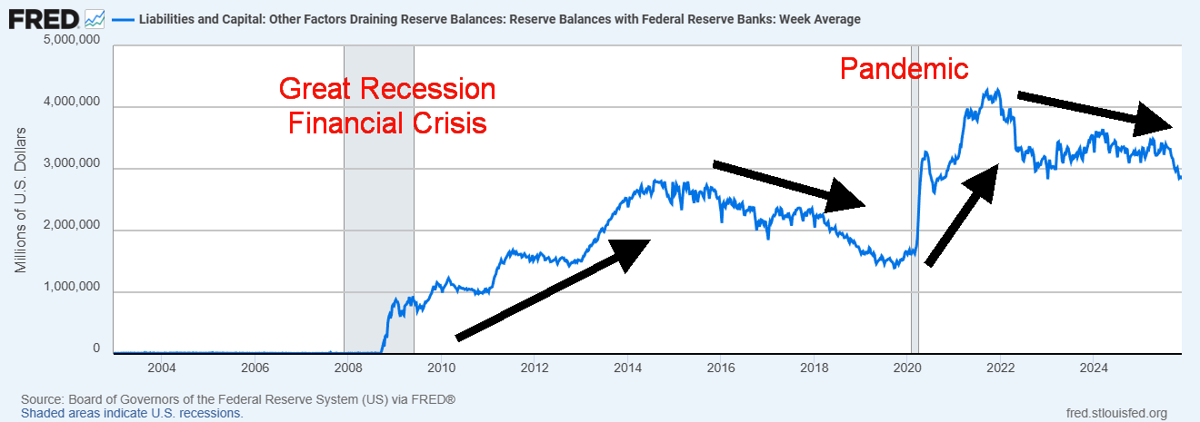
Ever since the Great Recession and financial crisis of 2007–2009, both the Fed’s balance sheet and money supply (M1) have increased sharply. This was even more evident after the 2020 pandemic, when, in particular, money supply (M1) exploded. Before 2008, Fed assets grew slowly at only about 4% per year. Then they exploded. Both the charts below (Fed balance sheet and M1) and bank reserves show this. All three peaked in 2014 when the Fed started quantitative tightening (QT). The same thing occurred in 2022 when the Fed once again moved to a tightening phase.
Fed Balance Sheet Total Assets, Money Supply M1 2002–2025 (billions)
Source: www.stlouisfed.org
Bank Reserves 2002–2025 (millions)
Source: www.stlouisfed.org
While Fed assets have been leveling out and bank reserves are still falling, we note that money supply (M1) is starting to grow again. But note that M1 is currency in circulation plus checkable deposits. Checkable deposits grow if banks are making loans or acquiring assets. That has been the case with commercial loans, which have gone up after the initial reaction and shock over the pandemic of 2020. Also note that if the Federal government’s deficit increases, that also adds to M1. Bank reserves are not a part of M1, but instead the monetary base (M0).
PCE and Core PCE, Fed Interest Rate 1960–2025
Source: www.tradingeconomics.com, www.federalreserve.gov
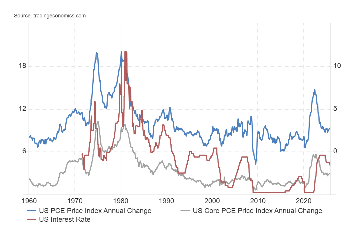
The Fed’s preferred method of measuring inflation is the PCE (Personal Consumption Expenditures) price index. Here we have the Fed rate, currently 4%, above both the PCE price index, last at 2.7%, and the core PCE, last at 2.9%. Both the PCE and core rates are above the Fed’s target rate of 2%. The PCE differs from the CPI (Consumer Price Index) in that it is a broader index, capturing expenditures such as insurance, whereas the CPI is a basket of goods. With the PCE remaining elevated, it suggests that the Fed should hold interest rates. However, this goes against those who see the economy weakening, unemployment rising, and consumer sentiment falling.
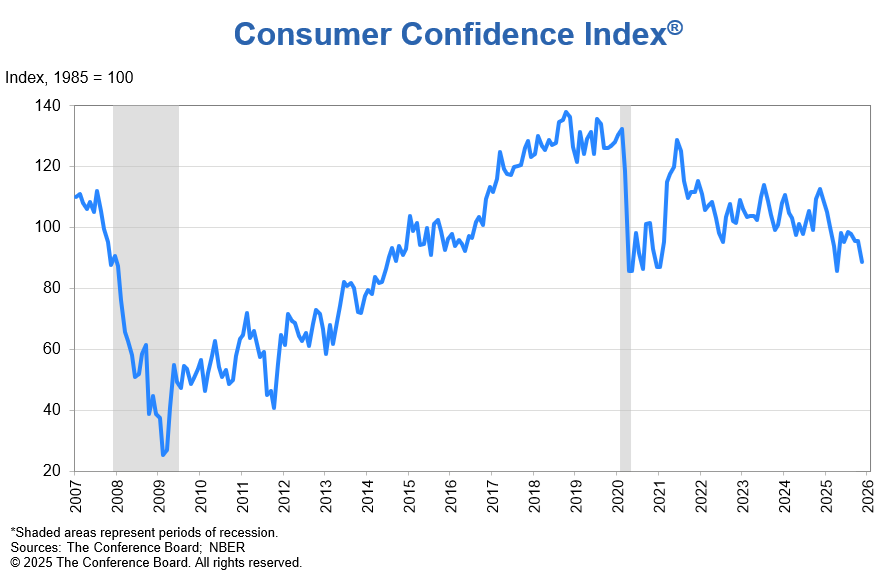
And that is exactly what is happening. The Conference Board’s Consumer Confidence Index fell sharply in November by 6.8 points to 88.7 from 95.5 in October. There is a drop in confidence in jobs, incomes, and financial situations, both now and in the future. Some of that may have been sparked by the government shutdown. Indeed, this chart is turned down and could soon break under the consolidation pattern that has been building since the pandemic. We note that the Michigan Consumer Sentiment Index, while it did bump up to 51 in November from 50.3 in October, remains exceptionally low, near levels last seen when a recession was going on, particularly during 1980–1982 and 2007–2009. This indicator supports the dove’s case of lowering interest rates now rather than waiting until a recession actually starts.
Consumer Confidence Index 2007–2025
Source: www.conference-board.org
Divisions amongst the Fed’s governors have in the past preceded a recession. But also, what happens is volatility picks up, which is what we are seeing now. Markets don’t know what’s going to happen, even as the market currently favours a rate cut at the December 9–10 FOMC. But what a divided Fed is telling us is that the economy is at a turning point, and we are getting closer to a recession. And that has ramifications, not only for the U.S. economy but also for the global economy.
Chart of the Week
VIX Volatility Index 1991–2025
Source: www.stockcharts.com
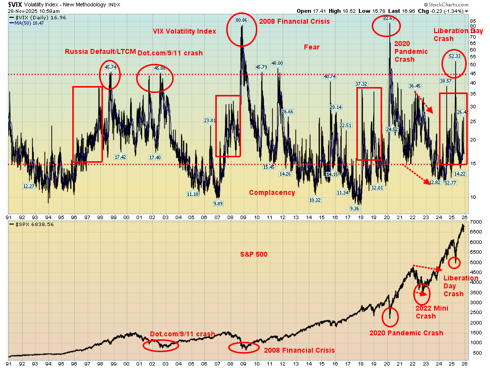
The VIX, or under its proper name, the CBOE Volatility Index, is probably not fully understood. Think of it as a fear gauge, a measurement of fear and greed on Wall Street. Canada has one as well, called the S&P/TSX 60 VIX Index. The premise is the same. The index measures the expectations of volatility for the S&P 500 over the next 30 days. It’s based on the options market. When investors are buying calls and not buying much in the way of puts, the VIX falls. When investors start buying a lot of protection through puts, the indicator goes up. Call it insurance. The VIX moves inversely to the S&P 500. So, when the S&P 500 rises, the VIX tends to fall and vice versa.
The indicator is on a scale where under 15 signals complacency in the market and over 40 shows the market is very fearful. In between, it can range from 15–40, registering some concern to rising concern. Divergences appear when the stock market is making new highs (or lows), while the VIX is making higher lows (or lower highs). That, like many other divergences, suggests we could be at or near a turning point. And right now, that is what we are experiencing.
The VIX has only been around with us since 1991. However, it has become an important tool for traders in particular, as well as for investment managers. What we have noticed is that there is an uptick in volatility (the VIX) that precedes a bigger problem, usually a crash or sharp sell-off. That’s when you get the divergences as the S&P 500 moves to new highs, but the VIX is no longer making new lows. Since 1991, we have witnessed this phenomenon at least four times:
- 1996–1999, preceding the dot.com–9/11 crash of 2000–2002
- 2006–2007, preceding the collapse of the housing bubble, along with the financial crisis of 2008
- 2017–2018, preceding a sharp correction in 2018, but not particularly the 2020 pandemic crash
- Today, 2024–2025, even as we did spike briefly during the “Liberation Day” crash in April 2025. Nonetheless, out of the Liberation Day crash, the S&P 500 went on to new highs, but the VIX didn’t plunge to new lows.
All this tells us is that something bigger is coming. What, we don’t know, but it is a warning. The VIX spiked during the financial crisis (2008) and the pandemic crash (2020), but it can also spike during geopolitical crises and flash crashes (like the Liberation Day crash). As well, if the markets pivot, there is rising uncertainty. Right now, we are experiencing rising uncertainty, both geopolitically and in domestic politics. Plus, we have the AI bubble waiting to burst, sticky inflation, falling consumer sentiment, and far too much debt (with governments, corporations, and consumers). As we’ve repeated many times, no, this time is not different; it’s just the circumstances that are. History doesn’t repeat itself, but it rhymes.
The VIX is currently predicting a rise in volatility, potentially big moves in the stock market, and overall fear is rising. What it doesn’t do is tell us which direction we are moving in; it doesn’t tell us when (timing), nor does it say anything about performance.
All this helps explain why gold (and silver) have been rising. That is another measurement of fear. Gold (not gold stocks) has no liability, has no counterparty risk, and can’t be destroyed. The warning signs are there. 2026 could be a pivotal year.
VIX Record High – 82.69 (2020)
VIX Record Low – 9.36 (2017)
VIX Historical Average – 19–20
S&P/TSX 60 VIX Index 2017-2025
Source: www.spglobal.com
Note the S&P/TSX Vix Index. It only goes back to 2017. Those spikes included the 2018 mini bear, the pandemic crash, and the Liberation Day mini flash crash.
Markets & Trends
|
|
|
|
% Gains (Losses) Trends |
|
||||
|
|
Close Dec 31/24 |
Close Nov 28/25 |
Week |
YTD |
Daily (Short Term) |
Weekly (Intermediate) |
Monthly (Long Term) |
|
|
|
|
|
|
|
|
|
||
|
S&P 500 |
5,881.63 |
6,849.09 |
3.7% |
16.5% |
up |
up |
up |
|
|
Dow Jones Industrials |
42,544.22 |
47,716.42 |
3.2% |
12.2% |
up |
up |
up |
|
|
Dow Jones Transport |
15,894.75 |
16,585.81 |
3.6% |
4.4% |
up |
neutral |
up |
|
|
NASDAQ |
19,310.79 |
22,365.29 |
4.9% |
21.0% |
up |
up |
up |
|
|
S&P/TSX Composite |
24,796.40 |
31,382.78 (new highs) * |
4.1% |
26.9% |
up |
up |
up |
|
|
S&P/TSX Venture (CDNX) |
597.87 |
937.34 |
9.7% |
56.8% |
neutral |
up |
up |
|
|
S&P 600 (small) |
1,408.17 |
1,471.61 |
4.5% |
4.5% |
up |
up |
up |
|
|
ACWX MSCI World x US |
51.43 |
66.44 |
2.7% |
29.2% |
up (weak) |
up (weak) |
up |
|
|
Bitcoin |
93,467.13 |
91,125.81 |
7.8% |
(2.5)% |
down |
down |
up |
|
|
|
|
|
|
|
|
|
|
|
|
Gold Mining Stock Indices |
|
|
|
|
|
|
|
|
|
Gold Bugs Index (HUI) |
275.58 |
677.44 |
14.1% |
145.9% |
up |
up |
up |
|
|
TSX Gold Index (TGD) |
336.87 |
798.98 |
11.3% |
137.2% |
up |
up |
up |
|
|
|
|
|
|
|
|
|
|
|
|
% |
|
|
|
|
|
|
|
|
|
U.S. 10-Year Treasury Bond yield |
4.58% |
4.02% |
(1.2)% |
(12.2)% |
|
|
|
|
|
Cdn. 10-Year Bond CGB yield |
3.25% |
3.15% |
(1.6)% |
(3.1)% |
|
|
|
|
|
Recession Watch Spreads |
|
|
|
|
|
|
|
|
|
U.S. 2-year 10-year Treasury spread |
0.33% |
0.52% |
(5.5)% |
57.6% |
|
|
|
|
|
Cdn 2-year 10-year CGB spread |
0.30% |
0.73% |
(4.0)% |
143.3% |
|
|
|
|
|
|
|
|
|
|
|
|
|
|
|
Currencies |
|
|
|
|
|
|
|
|
|
US$ Index |
108.44 |
99.43 |
(0.7)% |
(8.3)% |
up (weak) |
neutral |
down |
|
|
Canadian $ |
69.49 |
0.7156 |
0.8% |
3.0% |
up |
down |
neutral |
|
|
Euro |
103.54 |
116.01 |
0.7% |
12.1% |
neutral |
up (weak) |
up |
|
|
Swiss Franc |
110.16 |
124.52 |
0.6% |
13.0% |
down (weak) |
up (weak) |
up |
|
|
British Pound |
125.11 |
132.34 |
1.7% |
5.8% |
neutral |
down |
up |
|
|
Japanese Yen |
63.57 |
64.01 |
0.1% |
0.7% |
down |
down |
down |
|
|
|
|
|
|
|
|
|
|
|
|
|
|
|
|
|
|
|
|
|
|
Precious Metals |
|
|
|
|
|
|
|
|
|
Gold |
2,641.00 |
4,216.71 |
3.8% |
59.7% |
up |
up |
up |
|
|
Silver |
29.24 |
56.37 (new highs) * |
12.9% |
92.8% |
up |
up |
up |
|
|
Platinum |
910.50 |
1,675.00 |
11.0% |
84.0% |
up |
up |
up |
|
|
|
|
|
|
|
|
|
|
|
|
Base Metals |
|
|
|
|
|
|
|
|
|
Palladium |
909.80 |
1,449.50 |
5.1% |
59.3% |
neutral |
up |
up (weak) |
|
|
Copper |
4.03 |
5.19 |
4.0% |
28.7% |
up |
up |
up |
|
|
|
|
|
|
|
|
|
|
|
|
Energy |
|
|
|
|
|
|
|
|
|
WTI Oil |
71.72 |
59.44 |
2.6% |
(17.1)% |
neutral |
down |
down |
|
|
Nat Gas |
3.63 |
4.77 (new highs) |
4.4% |
31.4% |
up |
up |
up |
|
Source: www.stockcharts.com
* New All-Time Highs
Note: For an explanation of the trends, see the glossary at the end of this article.
New highs/lows refer to new 52-week highs/lows and, in some cases, all-time highs.
Source: www.stockcharts.com
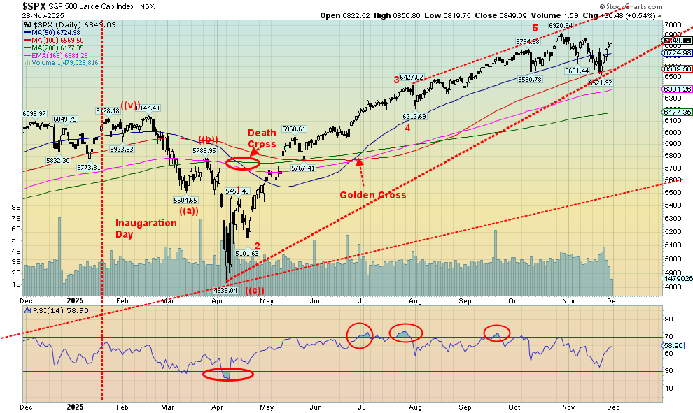
The last month of the year starts on Monday. It has been a phenomenal year with nearly everything up on the year. Okay, not oil, Bitcoin, and the US$ Index. December ranks as the third-best month of the year since 1950 with an average change of 1.5%. 2018 was the worst December since 1930, falling 8.7% for the Dow Jones Industrials (DJI) and the S&P 500, down 9.2%. We see a few signs that 2018 is about to repeat itself. Right now, the market is being driven by thoughts of a rate cut in December and suggestions of a new Fed Chair who is quite dovish, fitting President Trump’s thoughts on sharply lower rates.
On the week, the S&P 500 (SPX) rose 3.7%, the DJI was up 3.2%, the Dow Jones Transportations (DJT) was up 3.6%, while the NASDAQ gained 4.9%. The S&P 400 (Mid) was up 3.9% and the S&P 600 (Small) gained 4.9%. The S&P 500 Equal Weight Index rose 3.0% while the NY FANG Index was up 5.2%. In Canada, the TSX Composite hit new all-time highs, up 4.1%, while the TSX Venture Exchange (CDNX) gained 9.7%.
In the EU, the London FTSE was up 1.9%, the EuroNext was up 1.8%, the Paris CAC 40 gained 1.8%, and the German DAX was up 3.2%. None made new highs. In Asia, China’s Shanghai Index (SSEC) rose 1.4%, the Tokyo Nikkei Dow (TKN) was up 3.3%, and Hong Kong’s Hang Seng (HSI) rose 2.5%. The MSCI World Index (ex USA) ETF rose 2.7%.
It’s been a good year all around as we head into a month where the odds suggest further gains. However, we shouldn’t be too complacent, as there have been ongoing signs that the smart money is getting out. But when everyone is chasing the dream of making big money, warning signs are usually ignored. We have record margin debt, and that is not a good sign. Many indicators are lagging the euphoric up market, making lower highs. Volatility, as we have noted, is rising. So, heed it all as a warning.
That previous low was 6,521, so we need to break that level to suggest a top. With a close at 6,849, it is suggesting that we should see new highs in December. But will everyone join in?
Source: www.stockcharts.com
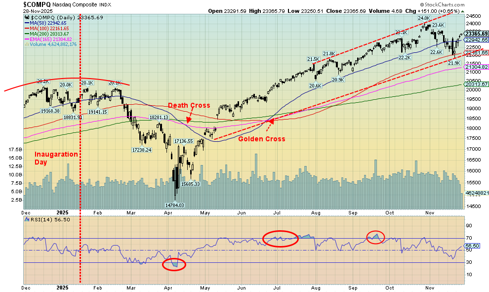
As with the S&P 500, the NASDAQ was up this past week but remains short of the recent all-time high. The NASDAQ gained 4.9% as thoughts of a Fed rate cut dominated. Some signs of further weakness in the economy were also noted. Leading the way was the MAG7, with the NY FANG Index up 5.2%. Individually, Google was the big winner, up 15.2%. Tesla jumped 9.7%. Broadcom, a near MAG7 stock, jumped 17.7%. All-time highs were made by Apple, Google, and Broadcom. We need to regain above 23,500 to suggest that the NASDAQ could once again make all-time highs. What’s important is that the recent low near 21,900 must hold on any pullback if we are to go higher. Otherwise, we could start to fall further. The market rose, mostly without interruption, since the Liberation Day April low, with the NASDAQ up 58%. The NASDAQ rose 95% from a low in October 1999 to its peak in 2000. So, does the NASDAQ have further to rise to record heights? New lows under 21,900 will end any thoughts of new highs. Interestingly, since 1930, the markets have been up 73% of the time in December.
Stock Market Performance Since Jan 2019
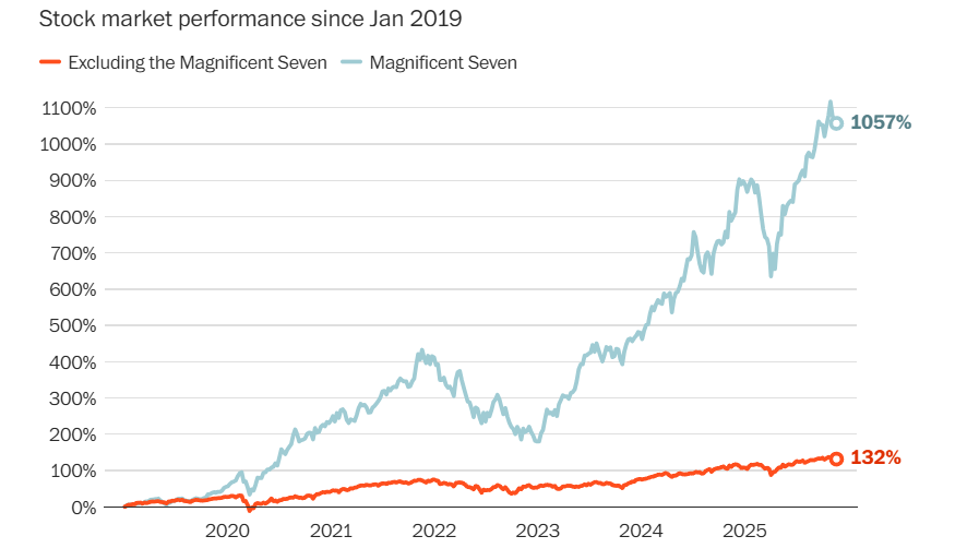
Source: www.bloomberg.com, www.washingtonpost.com /Fredrico Coco
This is an interesting chart we found in a Washington Post article (www.washingtonpost.com), “The ‘S&P 493’ reveals a very different U.S. economy,” Washington Post, November 24, 2025, that outlines the performance of the S&P 500 without the MAG7. It is an excellent depiction of the performance of the MAG7 vs. the remaining 493. It is a worthy demonstration of the power of the MAG7 vs. everybody else.
Selected Performance since Inauguration Day, January 20, 2025
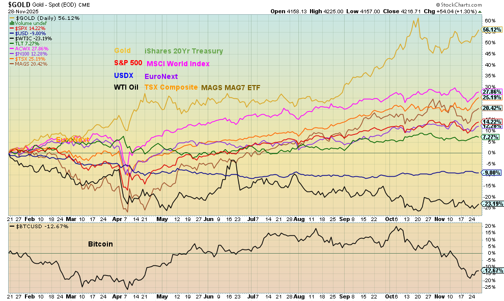
Source: www.stockcharts.com
Nothing has changed in the performance of selected markets since Trump’s inauguration in January. Gold remains well in front with more than double the next market, the MSCI World Index (ex USA) ETF. WTI oil brings up the rear, down 23.2% so far, with Bitcoin and the US$ Index not too far behind, or is it ahead? Gold appears to be headed towards being the best performer. We didn’t include the gold stock indices where both the Gold Bugs Index (HUI) and TSX Gold Index (TGD) are up over 100% in 2025.
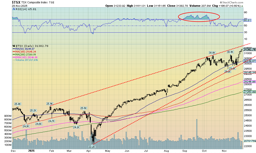
Source: www.stockcharts.com
Once again, the TSX Composite soared to new all-time highs, thanks to the surging materials sector. Golds (TGD) was up 11.3%, Metals (TGM) was up 9.5%, and Materials (TMT) was up 11.6%. TMT made all-time highs. Not to be outdone, Information Technology (TTK) also soared, up 7.9%. All 14 sub-indices were up this past week as the TSX gained 4.1%. The TSX Venture Exchange (CDNX) didn’t want to be left out and gained 9.7% but remains short of new highs. While they didn’t have the big gains of the Materials sector, both Consumer Discretionary (TCD) and Consumer Staples (TCS) made all-time highs, up 1.8% and 1.2% respectively. Financials (TFS) also made new all-time highs, up 2.3%.
It has been quite a run for the TSX. Until that top in October, the 6-month run from the Liberation Day low rose almost unabated. There has been barely a pause until the last couple of months. Now we are breaking out again with potential targets up 32,100. That gets us closer to the top of the channel. However, many indicators are now flashing danger/caution. All that suggests to us is that taking on new positions should be done cautiously. The Materials sector (Metals, Golds) may have more in it, but leaning in to take profits could be a wise idea. We don’t get a good sell signal until we break the recent low near 29,500. Going back under that recent high near 30,900 could be a warning sign. The TSX is up 26.9% in 2025, one of its best gains. The CDNX, not to be outdone, is up 56.8% in 2025. Going back to 1945, 2025 has thus far been the ninth-best year.
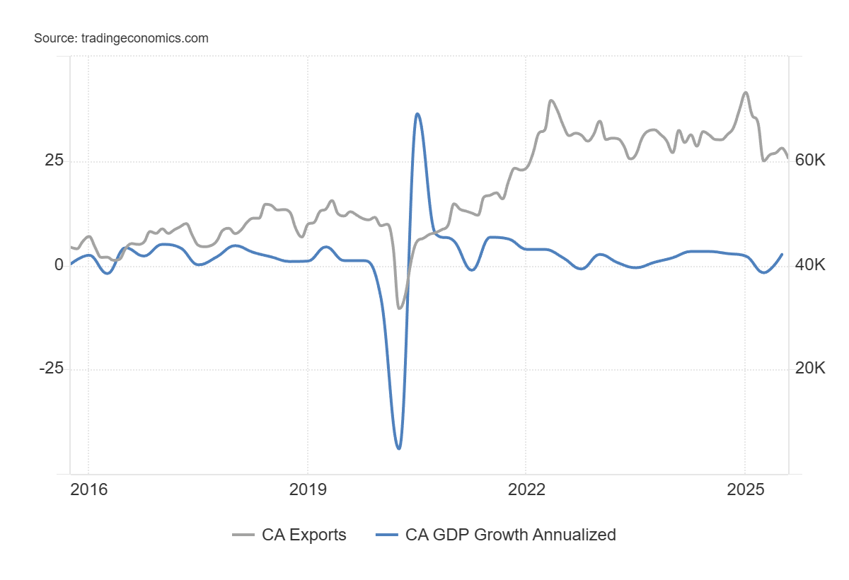
Canada GDP Growth, Exports 2015–2025
Source: www.tradingeconomics.com, www.statcan.gc.ca
Canada’s GDP rose 2.6% in Q3, above expectations of a rise of 0.5%. This followed a 1.8% decline in Q2. So far, Canada’s GDP has expanded 1.0% in 2025. A drag has been exports, which have been falling since January, primarily because of the ongoing trade war with the U.S. Imports have also fallen, but imports are subtracted when calculating GDP, so falling imports have a positive impact on GDP. While the quarterly gain looked good, falling exports are a concern. Imports falling in Q3, along with a surge in investment, particularly in residential structures and government spending, all helped the rise. Household spending fell. So, weakness is shown for exports and falling household spending. Government investment rose 12.2%, which can’t be expected to continue at that pace. Given slower growth elsewhere in the developed world and ongoing chaos in the U.S., it will be difficult for Canada to avoid any repercussions.
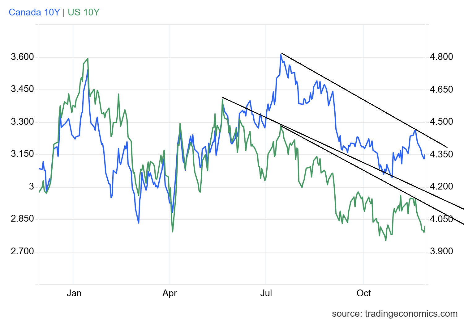
U.S. 10-year Treasury Note, Canada 10-year Bond CGB
Source: www.tradingeconomics.com, www.home.treasury.gov, www.bankofcanada.ca
The U.S. 10-year Treasury note briefly dipped under 4% this past week but closed back over at 4.02%. Bonds were being driven by thoughts of a December rate cut (now an 87% chance), plus further signs of economic weakness. ADP employment fell by 13,500 jobs this past week, suggesting growing weakness in the labour market. Retail sales for September were down 0.1% when they were expected to show a gain of 0.4%. Year-over-year (Y-O-Y) retail sales were up 4.3%, above the expected 3.9%. But again, the recent numbers suggested weakness. We’ll probably never see the October numbers.
Canada, not to be outdone, saw the 10-year Government of Canada bond (CGB) fall to 3.15% from 3.20%. To break out to the upside, the U.S. 10-year must break over 4.25% and Canada over 3.27%. That we failed downside follow-through suggests that the market still has inflationary concerns but is being battered by rate cuts, inflation, and a weakening economy. The U.S. 10-year needs to stay consistently under 4.00% to suggest lower yields.
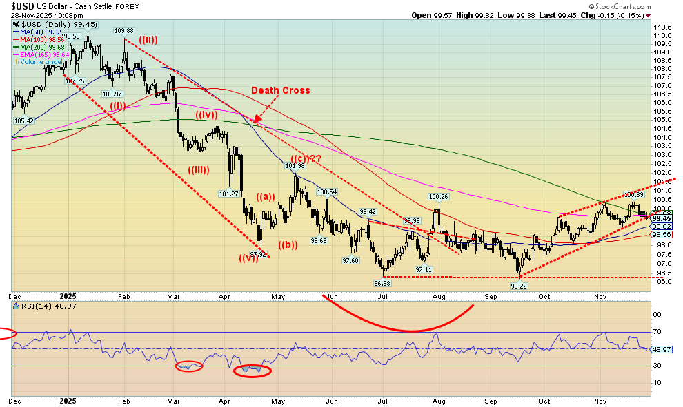
Source: www.stockcharts.com
The US$ Index faltered this past week, down 0.7%. It’s threatening to break the uptrend line from the September low. The prime reason for the fall was the growing expectation that the Fed would cut rates in December. Adding to that are thoughts that Trump’s choice to replace Jerome Powell is National Economic Council Director Kevin Hassett, who is well-known for his dovish views. The possibility of a peace deal in Ukraine also leaned on the dollar as the euro rose 0.7%. The Swiss franc was up 0.6%, the pound sterling jumped 1.6%, while the Japanese yen recovered slightly, up 0.1%. The Cdn$ rose 0.8%.
If we can break under 99, it will confirm thoughts that the US$ Index has probably topped on this pullback. Under 98.50, we start looking at the September low of 96.22. New highs above 100.40 will keep the uptrend alive. Indicators are largely neutral.
Source: www.stockcharts.com
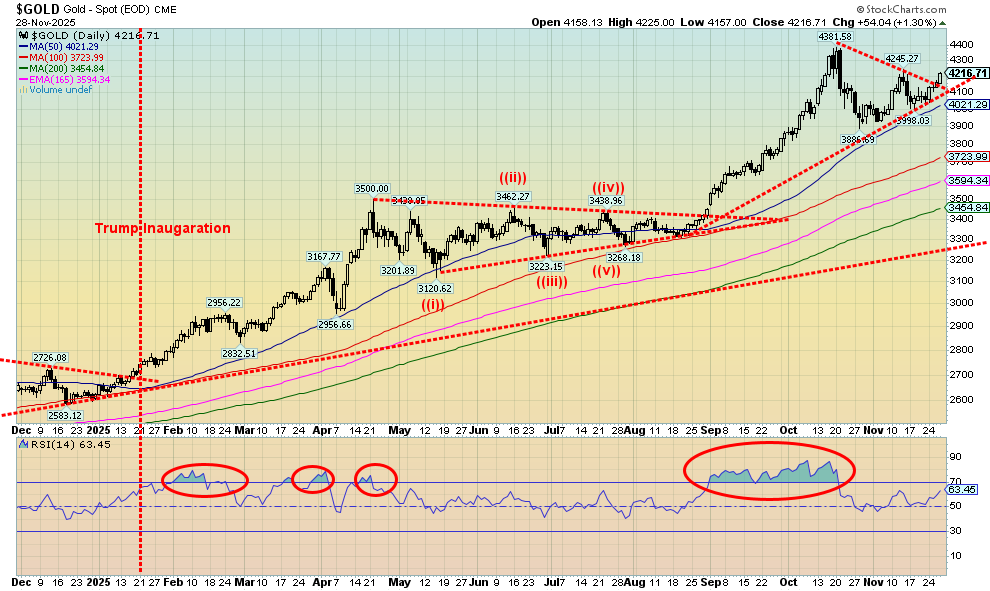
For the fourth consecutive month, gold rose. Gold has been up 10 of the 11 months of 2025 so far, with July being the only blemish. We are currently headed for our best year since 1979. Thoughts of a Fed rate cut at the December FOMC are driving gold higher. There are also thoughts of Kevin Hassett, a well-known dove who is closely associated with President Trump, becoming Fed Chairman once Powell’s term is up in May 2026. Since gold is a safe haven, one can’t ignore the continued huge buying of gold by central banks. This is against the backdrop of continued geopolitical issues, domestic issues in the U.S., threats of war against Venezuela by the U.S., and growing economic uncertainty, with some of the worst consumer sentiment since the Great Recession and the pandemic.
Gold rose 3.8% this past week, silver hit record highs, up 12.9%, and platinum was up almost 11.0%. For the precious metals, palladium gained 5.1% and copper was up almost 4.0%. The gold stocks soared, with the Gold Bugs Index (HUI) up 14.1% and the TSX Gold Index (TGD) gaining 11.3%. Despite the gain, gold’s RSI is 63.45, suggesting we have further to move. We haven’t yet made new highs, but we appear to be breaking out of the consolidation pattern. We are still shy of the point at $4,265 that would suggest new highs above $4,381 are probable. Once new highs are made, gold could then project up to $4,650. What’s interesting for 2025 is that gold, considered a barbarous relic, is up for 2025 while Bitcoin, which was supposed to be the saviour, is down for the year. Gold, silver, and the gold stocks have sharply outpaced everyone else in 2025. One could call it a golden year.
Source: www.stockcharts.com
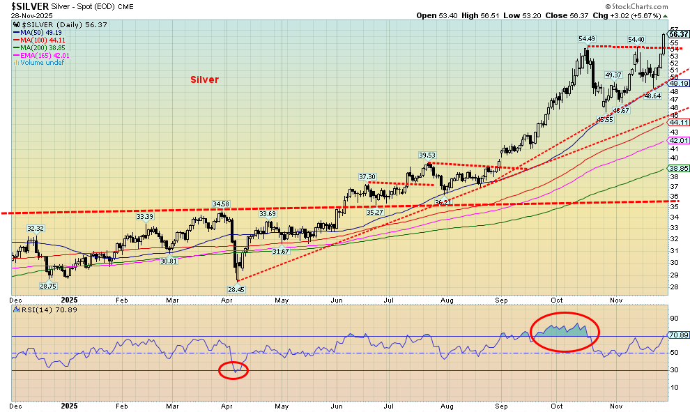
Hi yo, Silver, away! Echoes of the Lone Ranger. Yes, silver has been the star this past week, jumping 12.9% to new all-time highs. What’s more, silver is up 92.8% so far in 2025, guaranteeing that silver should have its best year since 1979. In thrusting out to new all-time highs, the breakout suggests that silver could make even higher highs. The current projection is potentially up to around $63.50. That sounds great until you realize we have to get to $197 to equal that 1980 high, inflation-adjusted. The 2011 high, inflation-adjusted, comes more into focus. We only have to rise to $71/$72 to equal that high. After being mostly overbought throughout September and October, we are once again approaching overbought. So, it’s a note of caution as divergences emerge. The Gold/Silver ratio has fallen to 74.80. Below 72.90, we will break the 2024 low and suggest that we have further to fall. There is a worldwide deficit of silver, a commodity used in numerous applications, electronics, solar energy, chemical production, and more.
So, we say it once again, hi yo, Silver!
Source: www.stockcharts.com
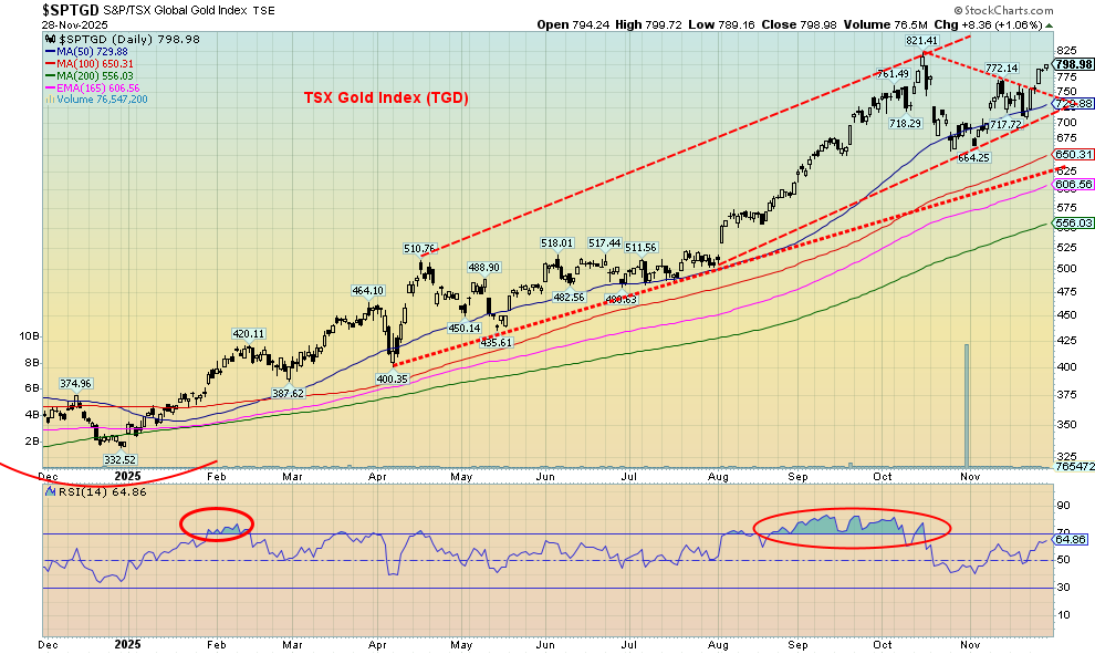
It has been a good year to be a gold bug and own gold stocks. With gold up almost 60% and silver up about 93% in 2025, the gold stock indices have soared. The TSX Gold Index (TGD) gained 11.3% this past week and is now up 137.2% on the year. The Gold Bugs Index (HUI) rose 14.1% and is up 145.9% in 2025. Some individual stocks are up even more, while the junior developers have also enjoyed a good year with numerous stocks up over 100% and some up 200%, even 300%, on the year. The TGD appears to have broken out of the recent consolidation. The pattern could project to 980, which, of course, would mean new all-time highs. The only down month was October. We did have about three months of extreme overbought conditions, so in some respects, the pullback in October shouldn’t have been a surprise. But are we now on another run? We are not yet overbought.
Source: www.stockcharts.com
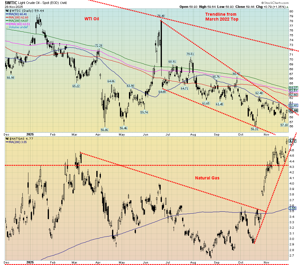
The losses keep piling up for WTI oil (Brent too) as WTI suffered its fourth consecutive monthly loss. WTI did gain 2.6% on the week but is down 17.1% in 2025. Most of that loss occurred after Trump’s inauguration. A glut of global oil and the possibility of peace in the Ukraine/Russia war have factored into the drop. OPEC is maintaining production and some other producers have increased their supply, adding to the glut. Strangely, while WTI oil prices have fallen for four months in a row, the TSX Energy Index (TEN) is up for three of the past four months. It’s as if the energy stocks know something the rest of us don’t. They are being accumulated. On the week, the TEN gained 1.1% while the ARCA Oil & Gas Index (XOI) rose 1.6%. Brent Crude rose 1.2% on the week.
The star of the week was natural gas (NG) at the Henry Hub, which gained 4.4%, reaching its highest level since 2022. Fear of cold weather was the culprit. Strong LNG exports also helped push NG higher. It wasn’t the case with NG at the EU Dutch Hub, which fell as the potential for a Ukraine/Russia peace deal rose. Milder temperatures in the EU also helped, as inventories are full.
WTI oil still needs to break out over $61 to suggest we might move higher. A major breakout over $72 is needed to really push WTI oil higher. Is there a potential catalyst to spike oil prices? Threats by the U.S. to attack Venezuela to overthrow President Nicolas Maduro may be the black swan event. The threat is there, but will it happen? Venezuela has the world’s largest reserves of oil, is the world’s 12th largest producer, and is a member of OPEC. Venezuela is also a close ally of Russia and China. NG gapped higher this week, making fresh 52-week highs. We’d have to get back under $4.25 to suggest to us that we may have topped.
Copyright David Chapman 2025
GLOSSARY
Trends
Daily – Short-term trend (For swing traders)
Weekly – Intermediate-term trend (For long-term trend followers)
Monthly – Long-term secular trend (For long-term trend followers)
Up – The trend is up.
Down – The trend is down
Neutral – Indicators are mostly neutral. A trend change might be in the offing.
Weak – The trend is still up or down but it is weakening. It is also a sign that the trend might change.
Disclaimer David Chapman is not a registered advisory service and is not an exempt market dealer (EMD) nor a licensed financial advisor. He does not and cannot give individualised market advice. David Chapman has worked in the financial industry for over 40 years including large financial corporations, banks, and investment dealers. The information in this newsletter is intended only for informational and educational purposes. It should not be construed as an offer, a solicitation of an offer or sale of any security. Every effort is made to provide accurate and complete information. However, we cannot guarantee that there will be no errors. We make no claims, promises or guarantees about the accuracy, completeness, or adequacy of the contents of this commentary and expressly disclaim liability for errors and omissions in the contents of this commentary. David Chapman will always use his best efforts to ensure the accuracy and timeliness of all information. The reader assumes all risk when trading in securities and David Chapman advises consulting a licensed professional financial advisor or portfolio manager such as Enriched Investing Incorporated before proceeding with any trade or idea presented in this newsletter. David Chapman may own shares in companies mentioned in this newsletter. Before making an investment, prospective investors should review each security’s offering documents which summarize the objectives, fees, expenses and associated risks. David Chapman shares his ideas and opinions for informational and educational purposes only and expects the reader to perform due diligence before considering a position in any security. That includes consulting with your own licensed professional financial advisor such as Enriched Investing Incorporated. Performance is not guaranteed, values change frequently, and past performance may not be repeated.
Read the full article here