Perhaps… at some point in your life you’ve asked yourself…
“How Bad Things Will Things Get Where I Live IF SHTF?”
Today, I’m going to give you an answer to THAT important question ☝️
But before I do, we must understand a few things first:
- What Makes A County Dangerous In A SHTF Event?
- How The Data Was Found, Analyzed & Why It Matters
- State Data Vs. County Data – Which IS Better?
- A Discussion On The Levels Of Danger (from worst to best)
- How You Should Interpret Your County Results…
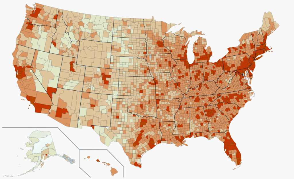
What Makes A County Dangerous In A SHTF Event?
First, before ANY of of the following data is helpful, we must agree on WHAT makes a county dangerous…
Now, I realize that’s a loaded question…
The number of potential dangers is endless and highly dependent on geographic location, right?
For example:
IF we’re talking about natural disasters, there are all sorts of regional concerns, such as:
- The Atlantic & Gulf Coasts have Hurricanes.
- The Midwest & South have Tornados.
- The West has Droughts, Wildfires & Earthquakes.
- Yellowstone is overdue for a Super volcano.
- The Pacific Coast has Mudslides and is due for a massive Tsunami.
- Heatwaves, Blizzards, Avalanches, Etc.
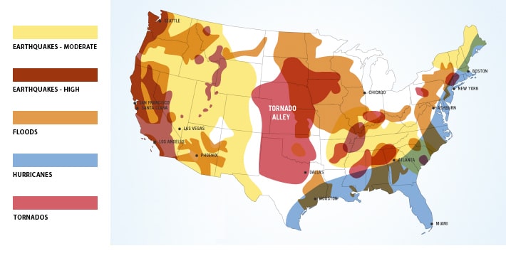

And this is just a short list of possible ‘Natural Disasters.’
What about “man-made” disasters as well, such as:
- Widespread Riots
- Civil Unrest | War
- Mass Starvation
- Financial Collapse
- Nuclear War | Fallout
- Nuclear Fallout
- EMPs Strikes
- Super AI
The truth is:
There are potential threats all the time, no matter where you live!
Risk is a fact of life.
Some locations have one type of threat, others have another.
But it’s also true that some areas carry more or less risk, right?
So “RISK” is not something you can remove entirely; no matter where you live, stuff will happen from time to time.
But that’s not to say you can’t manage risk… You can.
And there’s 1 major factor that will take any of the above “risks” and multiply it.
This multiplier can take an emergency and blow it up into a tragedy of epic proportions…
Any guess what this “1 THING” might be?
Population Density
A local, regional, or national disaster becomes worse with MORE people.
High-density urban areas carry a significant risk multiplier should the world go sideways for any length of time.
Heck, even folks several hours away from major urban areas are not safe.
Why? Because it doesn’t matter WHAT the emergency is…
If food or water supplies are cut off, and folks begin to starve, we’re only about 3 to 5 days from complete chaos.
Our modern world functions relatively well when there’s “enough.”
Sure, there are examples of areas where this might not be true.
Where “law and order” have broken down, people get shot daily.
Where drugs, crime, murders, and prostitution run unchecked.
But if mass starvation erupts in an urban area (as well as its Metro) – it’ll become a massive Tsunami of human conflict.
I’m talking complete lawlessness – mass lootings, riots, murders, theft, rape, pillaging, etc.
Modern society remains “civil” as long as there’s enough water and calories to go around.
I’m not saying it’s always pretty.
There are currently WAY too many folks who go to bed hungry.
But what if THAT situation spreads to EVERY home in an entire city, region, or nationwide…
Well…We can all agree the further you are from such a mass of desperate humans, the safer, right?
You see, this is why I began looking at my local data.
I wanted to determine if I was in a “Danger Zone” or not…

Want a free 78 item prepper checklist?
Enter your email below to instantly download this Complete Checklist PDF. No purchase necessary. 👇 👇
How The Data Was Found, Analyzed & Why It Matters
I pulled the “State” level information with my first attempt to look at population densities.
State Data
At first, I thought this might be helpful.
I figured it would show me where the worst “Danger Zones” are.
And so, I quickly found each States estimated population (based on US Census Data):
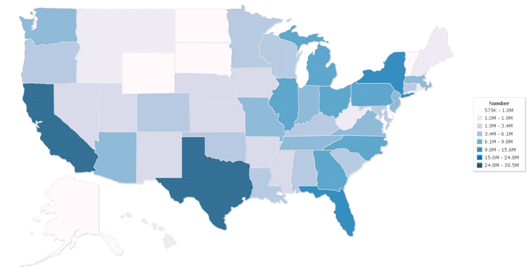

And while looking at Raw Population data by State is interesting…it was nearly worthless to tell me what I really wanted to know.
I mean, with State Population data, you’re NOT comparing Apples to Apples.
Comparing Texas to Rhode Island’s is less than helpful at the Statewide level.
Those two States’ Land Masses are not even in the same category.
So how do we “equalize” these vastly differing States to get a number that’s useful?
You take the Raw Population and divide THAT number by the Land Mass (square acres).
Now you have:
How many people there are PER square mile in each State.
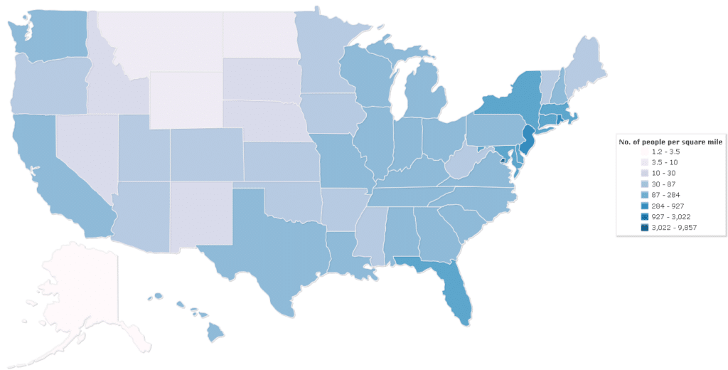

This was better.
This information was somewhat helpful.
Now I could compare vastly different-sized States and see which had more people packed into them.
For example:
We all know New Jersey is a small State and is very cramped, right? And the data rings true.
New Jersey has ~1,158 people per square mile.
Great, but how does THAT compare to…Florida (another State with LOTS of people)?
Florida has ~414 people per square mile.
That means Jersey is roughly 3X more dense than Florida.
So, if you live in Florida, you’re much safer from SHTF risk than Jersey…
But not so fast…
Florida is a reasonably large State, right?
But are the people living there evenly spread across the entire State? No way!
We all know most folks squeeze in along the coastlines.
And the lowest part of the middle of the State is all Swampland and National Parks.
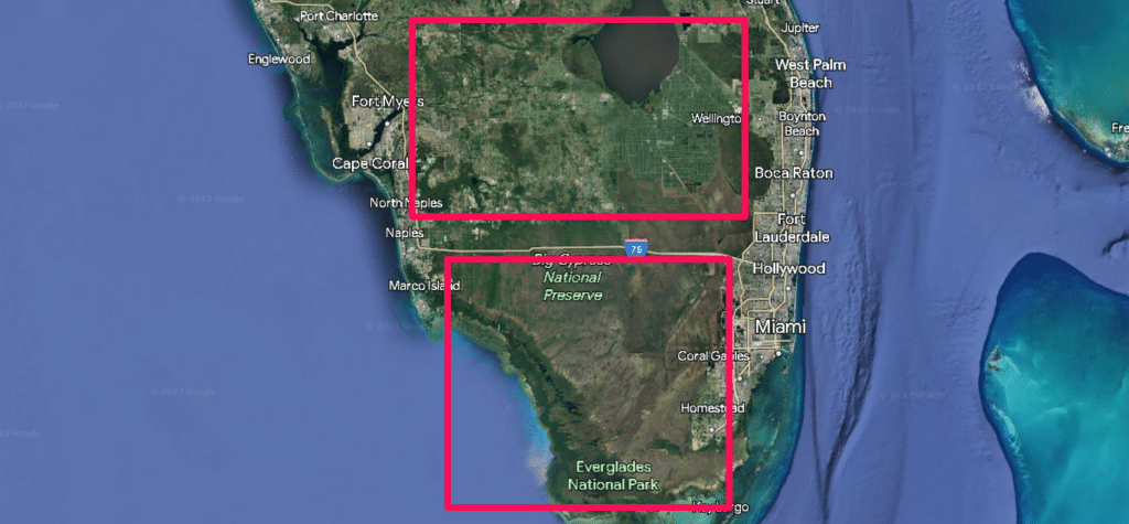

Since New Jersey is a relatively small State, its average density seems reasonable.
Sure, some areas will be higher than the 1,259 and others lower, but the differences between the highs and lows will be fairly close.
But this is NOT the same in Florida.
The difference between the cities and the rural swamp locations are miles apart.
It’s like comparing the Sun to the Moon.
So now we’re back to “square 1,” and the only way to help achieve data that can be helpful is to chop these States up into smaller areas.
And this is where counties come in.
County Level Data
Every State (in the US) is broken up into a bunch of different counties.
This is a way to help folks within a State keep politics and public services more local.
And while no two counties are identical in size, and like States, some counties are enormous while others are tiny, using County data is still way better than State wide data.
And I thought tracking down this data would be a breeze.
ifr
I figured I’d do a quick Google search, click a button, and be done.
But it turns out that finding land mass and population data on a per-county basis is quite elusive.
But with persistence and some good old fashioned (copy/pasting) …I got it done.
With a bit of sleuthing and elbow grease, I could find county population size AND land mass data.
And NOW, finally, I had the Holy Grail of US population density data.
I could now compare different US Counties nationwide and see which ones had the highest and lowest densities.
I did the math (in an Excel spreadsheet) and then sorted from highest to lowest.
Viola. Crazy useful data.


I finally had the “Danger Zone County” info I wanted at my fingertips.
I started pouring over the data, double-checking, and analyzing.
Yup, I enjoy doing this… I’m an Engineer (a.k.a. Engine “NERD.”)
But I quickly noticed some anomalies that didn’t make sense.
I assumed all the highest-density areas would be the superdense US cities (New York, San Fran, Atlanta, Chicago, Etc.)
And while all those Counties were near the top, some were further down the list than anticipated.
While there were a few tiny counties (like Manassas Park City County in Virginia) that were higher on the list than counties near Philadelphia, Tampa, Chicago, St. Louis, and even Atlanta…
What in the world was going on?
So, I dug in some more, and here’s what I found…
Counties come in all different shapes and sizes.
For example:
The most densely populated parts of Atlanta (and its Metro) have a foot in several different counties:
There’s Fulton County, Cobb County, DeKalb County, and Douglas County.
And many of these “Atlanta area” Counties extend far away from the city into areas with much lower population densities.
These county shapes and sizes can play into the same issues I saw with the State Level data.
The counties’ size, shape, and layout affected my comparison from being perfect.
Fulton County is a perfect example of this:
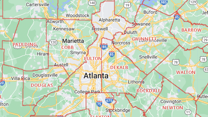

It extends way to the northeast AND southwest of the dense urban areas.
Thus, lowering its OVERALL average population density.
So, after more analysis, I discovered these oddities were NOT THAT big of a deal.
Sure, a few counties were hitting a higher density number than expected, and a few major urban areas were slightly lower…
But in general, over the entire list of 3142 counties in the United States, the highest density areas landed near the top, and the lowest were near the bottom.
And the middle ones were… in the middle.
So, overall, this was still extremely useful data, even if it wasn’t perfect.
Now, during this deep dive, I noticed another interesting phenomenon.
Sometimes I’d see some lower population densities in States I knew for a FACT were relatively small AND highly populated.
So, being curious, I had to find out what was going on.
I discovered some areas in the US that may have extremely low populations BUT are slap dab between several major metropolitan areas.
Often these areas are only a 1- or 2-hour drive from major cities (sometimes less).
For example:
Dorchester County, Maryland, has a Density of .090 people per Square Mile.
But Maryland, the State has one of the highest average Population Densities at .992
So, Dorchester County is 11X less dense than the State average.
That’s what I call an anomaly.
Here’s what’s going on…
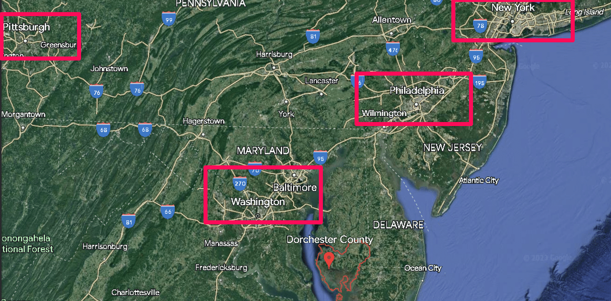
If you pull up a map of Dorchester County, you’ll see something right away that takes up a large chunk of the area:
Blackwater National Wildlife Refuge
This Wildlife Refuge is ~ 43.75 square miles – while the entire County is 540 square miles.
So nearly 8% of the area has a population density near ZERO – while the surrounding areas are also very low-density.
This County is a low-density Island surrounded by a sea of high-density cities.
For example:
- From the Eastern Edges of Washington, DC, and Baltimore, MD, are only about 1-hour drive (63 miles away).
- The South Side of Philadelphia only takes under 2 hours at 102 miles.
- Plus, there’s Richmond VI not too far away, as well as Norfolk | Virginia Beach area.
- Atlantic City is within a few days’ walk.
- Heck, THE highest density and largest city (New York City) is only a 3-hour drive and 190 miles away.
So, while Dorchester County “looks” like a safe haven on paper, in reality, I wasn’t comfortable with where it sat on my ‘Danger Zone County List.”

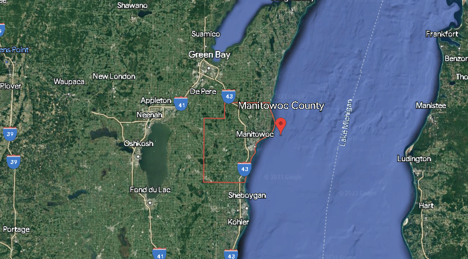
I mean, in my spreadsheet, it’s right next to places like:
- Sebastian County Arkansas
- Barry County Michigan
- Manitowoc County Wisconsin
- Upshur County Texas
Sorry, but just looking at a map, you can tell these are NOT comparable locations.

So, I had to figure out how to level-set these Counties somehow.
Otherwise, while the County data was better that the State data, it still had significant problems.
That’s when I decided to combine the State data with County data.
A Mix 95% County | 5% State
County Data is obviously much better than State data (I already proved that above).
But the State data still provides SOME helpful information.
If a State has a very high average density population (even if it’s all very localized to a few major cities), that means any counties within such States are nearby high urban areas.
This “rule” works better for smaller States and less so for large ones.
But in general, States with a very high population density are at a higher risk (no matter how sparse a County is) than a State with a very low population density.
While an individual County may be very low, if it’s within an hour or two of major cities, people will be forced out of these cities looking for food and water in times of massive chaos.
Of course, if you have 2 counties with similar densities, the one in the State with a lower population density has a lower risk.
So, I decided to use both the State and County data – in a weighted form.
Basically, I gave the Counties data 95% of the weight and the State data 5% of the weight.
By doing this, I had a number that primarily used the hyper-localized County data but used a bit of State data as well.
That way, if two Counties had similar data, but one was in Iowa while the other was in Delaware.
Well… the County in Iowa would likely be safer if all hell broke loose, right?
So that’s how I came up with this data to determine where the actual “Danger Zones” and “Safe Zone” Counties.
Note: You can quickly find a specific county using your devices ‘search functionality’…
- On PC Desktop Use: Control + F
- On Apple Computers Use: Command + F
- On Mobile Devices: Go to browser your settings and look for something like: “Find in page”

Want a free family-first food planning guide?
Enter your email below to instantly download this Complete Guide PDF. No purchase necessary. 👇 👇
A Discussion On The Level Of Danger (from worst to best)
Now that the Danger Zone County data made more sense.
It was time to break it apart into different groups based on risk.
Out of the 3142 Counties, I didn’t want just to say:
Higher = More Risk | Lower = Less Risk
THAT seems like dumping a ton of data in your lap without much use.
So, I began chunking up the data by Median.
I won’t bore you with statistics and the difference between Average Vs Median.
Look it up if you’re a nerd like me; otherwise, trust me that Median is better for our purposes.
Basically, I cut up the data into several key groups:
- HELL ON EARTH
- IT’S STILL GONNA GET NASTY
- NOT SAFE YET – MUST BE READY
- ON EDGE – REMAIN DILIGENT
- DECENT – CAN RELAX A BIT
- PHEW…SAFE HAVEN
Now, I want to review each category to give additional context.
HELL ON EARTH
If you live in one of these ‘Super Danger Zone Counties’… good luck, my friend; you’ll need it.
If society fails and moral compasses are broken, you will probably get mugged, beaten up, raped, or die.
OR you’ll be forced to do those things to other humans to “stay alive”…
There will be millions and millions of starving people.
IF SHTF, it’s gonna be HELL ON EARTH.
That’s why I RECOMMEND you move away from living in these areas and find somewhere safer.
Even if it’s not the “safest” location, anywhere is almost better than where you are now.
The only recourse you’ve got (IF you ignore my advice and decide to stay) is either:
- Stockpile a crap ton of food, water, firearms, ammo, and prepper supplies (and be ruthless about using the ammo)
- Bug out at the first sign of collapse to a location that’s much safer
IT’S STILL GONNA GET NASTY
This category isn’t much better than ‘Hell On Earth,’…
Perhaps you can “ride out the chaos” with enough supplies.
But you’re still more likely than not to become a statistic.
If I were you, I’d be looking to bug out.
I’d plan several routes out of the city, with a vehicle stockpiled with supplies (stagged 20 miles out of town) and a bug-out location in mind.
I wouldn’t plan to “hunker down.”
NOT SAFE YET – MUST BE READY
You’re still in the crosshairs here.
Many of the Counties in this category are suburbs and metros of major cities.
Sure, there’s a bit more distance between neighbors and fewer mouths to feed.
And the bonds between neighbors (and neighborhoods) may be stronger.
Working with other like-minded folks may be possible to carve out some supply sharing and security…
You’re not on the extreme side of things, but there will still be a lot of hungry, desperate folks to deal with.
And you’re likely within walking distance of the inner-city folks who will be forced out and heading your way.
- Some folks will still hunker down and protect what’s theirs.
- Others will run for safer wide-open spaces.
Either can work, but you need to know and plan ahead.
ON EDGE – REMAIN DILIGENT
OK, we’re finally in ‘smaller cities’ or further away from the major ones.
Either way, things are not looking quite as bleak.
Your chances of becoming a statistic are dropping – but you still can’t let down your guard.
You must prepare and plan ahead, or you’ll become one of the fragile, desperate masses.
You can build an actual “boots-on-the-ground” survival coalition here.
There’s more space between houses, or the cities are smaller.
Either way, unless we’re talking existential threat, you have some runway to ride out the chaos…
DECENT – CAN RELAX A BIT
If you live in one of these counties, you’ll probably be OK in all but the worst-case situations.
You’re far enough away from the highest-density areas for the fragile masses to walk to.
So, defending and keeping your stockpiles safe is a much easier task.
Plus, people in small communities take personal responsibility and self-sufficiency more seriously.
This means there will be more trust between neighbors and more bartering possibilities.
Often folks are more religious and have a higher moral compass.
They come together in times of crisis, which can help avoid mass starvation.
PHEW…SAFE HAVEN
If you’re worried about a future widespread, prolonged disaster, and you’re willing to relocate…this is where you should start.
Now, I’m NOT saying there’s ZERO chance of emergencies or chaos in these locations.
There’s no escaping some risk.
However, due to the lower population density, you’re not in a zone where the risk is EXPONENTIAL.
Your most significant risk in these locations is not getting help from State or Federal resources if things go sideways.
For the fragile masses, THAT idea is scary.
But for “The Resilient Few,”… those who are self-sufficient, THAT idea is a dream come true.
- You don’t have to spend much time planning a bug-out (unless you must leave due to a wildfire).
- And you can stockpile a bunch of calories and know it’s safe.
- You can raise farm animals (chickens, goats, rabbits) if you have some land.
- You can grow your own food. You can build an aquaponics system.
How To Interpret Your Results
Now that you have everything you need to use this data and understand what it’s telling you.
In the Danger Zone County Data, you’ll see a County Grade, a State Grade, and a color that represents which risk category you fall into.
Search for your County (or friends, parents, and relatives), and you’ll better understand how dangerous THESE areas are to a SHTF event.
- Perhaps you live in a danger zone county, and THIS is the kick in the pants you needed to finally relocate.
- Or maybe you can’t relocate but are inspired to stockpile more food, water, medicine, GUNS, and AMMO.
- Or perhaps you live in one of the lowest-risk areas, and your stockpiles are ready– Well…with this info, I’m guessing you’re gonna sleep like a baby tonight!
Now, of course, I don’t know YOUR specific details:
- I can’t possibly understand all your goals, fears, and limitations.
- I don’t know your age, if you have kids or anything like that.
- I also don’t know if you have a hidden underground bunker.
So only YOU can decide the best course of action now that you know more about the your population density risks.

Want a free 104 item bug out bag checklist?
Enter your email below to instantly download this Complete Checklist PDF. No purchase necessary. 👇 👇
But there is 1 THING I DO KNOW…
Since you’re still reading this, I KNOW YOU CARE.
You care about your safety, your family and your future.
You want to figure out how to survive in a future that’s getting less safe and less secure every minute.
I know for a FACT that you’re a responsible adult who is either:
- Reasonably self-sufficient already OR
- Willing to get serious about it ASAP
If either is true, I invite you to check out a program I built from the ground up.
![]()
It’s the BEST way I know to get more prepared FAST.
It’s consists of:
- An engaged community of like-minded folks
- Badges you can earn (think Scouts for Preppers)
- Lots of =challenges you can take
- Biweekly video calls with ME and other members
Click here now to see a better overview of this product, such as:
- Why you need it
- What it provides
- A sneak peek tour
- Tons of member reviews/testimonials
- And current pricing
I think you’ll be blown away at how unique this offer is and the reasonable price point.
So don’t wait; click here now to check out The Resilient Life.
Until next time:
Prepare, Adapt & Overcome,
“Just In Case” Jack
P.s – I just took this FREE 60-second ‘Readiness Score Quiz’👇
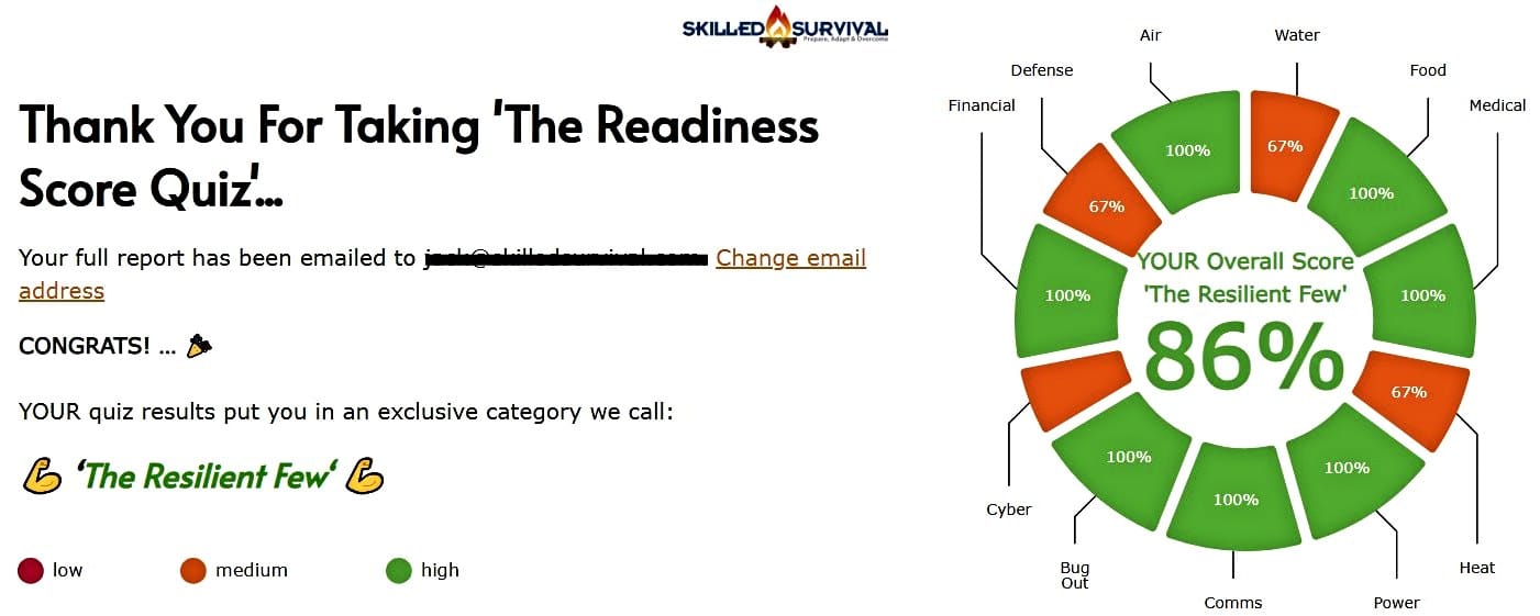
AND… I’ve still got a few gaps in my preps…🤔
But at least, I’m not part of ‘The Fragile Masses’. 👍
Find out where YOU stand by answering a few questions…


Get My 10 Steps To Basic Preparedness Video For FREE.
Plus daily survival tips (unsubscribe anytime).
Recommended Reading
Read the full article here


Leave a Reply